Year
2023
Experience
Creative Direction
Brand Identity
Logo Design
Graphic Design
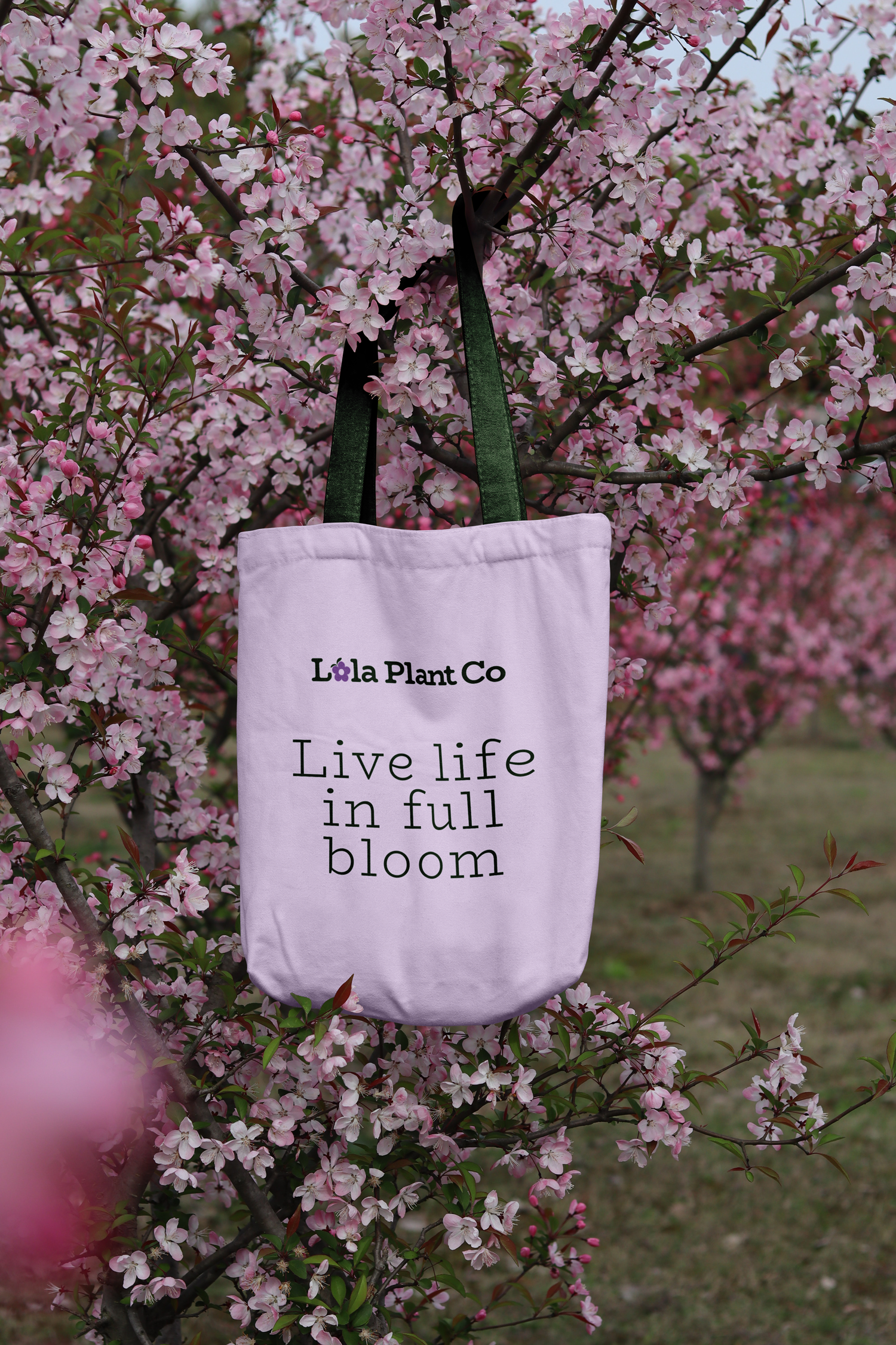
Lola Plant Co. is a new brand based in Raleigh, North Carolina, focused on bringing plant pups to your doorstep.
My Role
Together, myself and owner Jae Carbon developed a new identity to resonate with urban plant enthusiast. This new brand needed a flexible logo suite, color palette, typography, and patterns.
Lola Plant Co.
BRAND PERSONALITY
Whimsical
•
Earthy
•
Cheerful
•
Whimsical • Earthy • Cheerful •
A new brand for the urban plant parent.
With roots earthed in Philippino culture, Jae and her mom launched a brand they could cherish together. The name Lola Plant Co is inspired by the word Lola, meaning grandmother.
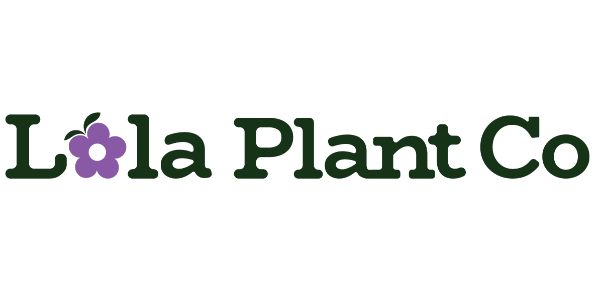
It was essential to create a logo that struck a balance between tradition and contemporary warmth. To achieve this, I selected a decorative serif typeface that was tailored with rounded edges, infusing a touch of playfulness.
The substitution of the letter "o" with a flower in Lola not only delights our plant enthusiasts but also reinforces our brand's whimsical and cheerful personality. This font choice captures the perfect blend of timeless roots and a homey, inviting feel.
The logo uses a minimal color palette, focusing on two primary colors to enhance our brand recognition. By embracing a dark green shade, the brand evokes a sense of enchantment reminiscent of secret gardens.
This color choice reflects connection to nature and the spirit of growth and renewal. Additionally, the use of violet represents serenity, embodying the joy associated with the brand. Together, these colors symbolize the harmony between new beginnings and family tradition.
To enrich the visual identity of Lola Plant Co, I expanded the color palette beyond the primary logo colors. Alongside these core hues, I selected a lavender color to compliment the youthful and playful energy of the brand. Seeking to pay homage to the nurturing traits of Mother Nature, I incorporated a secondary green color.
Then white was strategically chosen to counterbalance the vividness of the other colors, grounding the brand's identity and giving it an airiness quality. Together, this thoughtful selection of colors adds depth and resonance to Lola Plant Co's overall brand aesthetic.
Type is a critical part of any visual identity, so I knew I had to choose the perfect font for Lola Plant Co. The logo uses this same font to maintain consistency, however it was slightly altered to be more bespoke. BioRhyme drew me in immediately with the whimsical descenders and loops within this typeface, so I opted to use it for both the primary and secondary font.
Its blend of tradition and playfulness provided the ideal juxtaposition for Lola Plant Co, aligning with the brand's vision. To ensure legibility and a timeless appeal, Lato Regular was chosen as the supporting font for body copy.


Branding
Cheat Sheet
A multi page guide book was too extensive for the initial launch as a small business.
This cheat sheet brings clarity on how to best use assets and stay consistent across all brand touch points like social media, packaging, the website, and more.
Customizable cheat sheet created by Abi Connick


